
Introducing the Shades of Spring
A window into the colour trends of this season
Spring is a time of renewal and growth, and what better way to celebrate this season than by refreshing your home's interior design with the latest color trends? With the arrival of spring, we are seeing a shift towards light, airy, and cheerful hues that reflect the beauty of nature.
From soft pastels to bold, vibrant shades, the color palette of this season is sure to inspire and invigorate your space. Whether you are looking to incorporate these colors in your furniture, decor, or accents, there are plenty of ways to embrace the spring color trends and bring a sense of freshness and vitality to your home. In this article, we will explore some of the top spring color trends for interior design and provide tips on how to incorporate them into your décor.

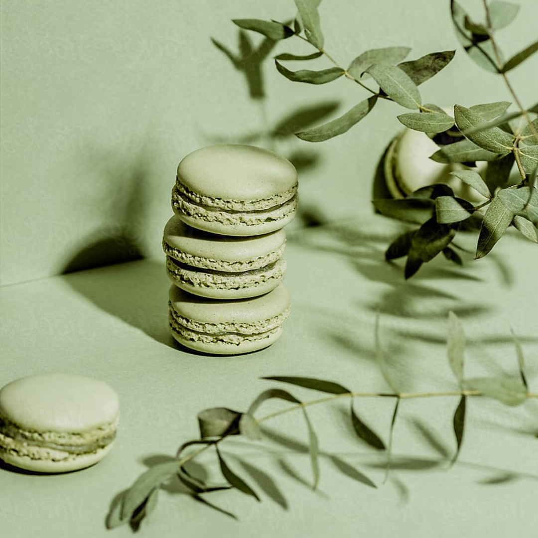
IMAGE CREDIT @the_greengallery
Digital Lavender
An already much loved hue in fashion as well as interior design, this energetic shade of lavender is predicted to come back as star of the show in 2023. Gemma Riberti, WGSN’s Head of Interiors explains:
“This shade poses that much needed cautious optimism and escapism that people are craving post-pandemic and even in times of budget crunch, it is imaginative and creative but also speaks of hope and balance.”
When two colours of brown and lavender are paired together, magical things happen.
Complementary Colours


Image Credit: Dulux
Wild Wonder
The Dulux colour of the year 2023 has been revealed as Wild Wonder, a beautiful warm neutral rooted in nature.
It is a warm neutral that evokes barley or wheat just before it has ripened. With a golden tinge and green undertone, the colour plays with light and will look greener on one wall, and more gold on another, bringing a connection with nature to your neutral living room ideas.
Pair with shades of the sea such as cool blues to create a balance within a space.
Complimentary Colours

Vert De Terre
Lending a sense of tranquillity to the home, it's fresh, muted, and gently brings a comfort associated with the natural world. It's a good colour to play around with as it goes with many things.
Pink and green are a classic pairing that crops up time and time again in modern interior schemes. These two shades work so well because they create a sense of balance. Pink softens and warms up a green tone, while the tones of olive green keeps the pink grounded and earthy.
Complementary Colours

Image Credit: BEHR
Blank Canvas
No matter what design you gravitate toward, Behr’s Blank Canvas acts as a timeless neutral. We recommend layering the colour with creamy ivories, beiges, biscuits, and lattes, whilst black can add a dramatic contrast.
This colour can help create a soothing oasis at home. Design and wellness are intertwined in so many ways and Blank Canvas is the perfect shade to elevate your at-home self-care space.